- Business Model- How do you make money?
- Networks and Alliances- How do you join forces with other companies for mutual benefit?
- Enabling Processes- How do you support the company's core processes and workers
- Core Processes- How do you create and add value to your offerings?
- Product Performance- How do you design your core offerings?
- Product System- How do you link and/or provide a platform for multiple products?
- Service- How do you provide value to customers and consumers beyond and around your products?
- Channel- How do you get your offerings to market?
- Brand- How do you communicate your offerings?
- Customer Experience- How do your customers feel when they interact with your company and its offerings?
|
I am preparing a new post for Diagnostic Imaging on the diffusion of innovation. I am interested in how radiology and healthcare generally adopt innovation. I think that this actually is dictating the development of innovative solutions in the market. I think there are 3 main developers of innovation: internally, start-ups, and large companies. I am exploring in the piece how the different segments react and cause/delay innovation- whether this be through PACS/RIS, business or data analytics, workflows, security, or other technologies. This lead me to explore the types of innovation that can occur in the market place. This lead me to Doblin's Ten Types of Innovation. I realized that I was missing something. I was thinking of innovation as strictly a process or offering innovation. There are other types, such as finance and delivery. Maybe I will have to do a two part series now... See the 10 types listed below:
One open source software profiled at SIIM 2013 is ANCR. ANCR enables automated graded notification of referring providers when results from imaging exams are deemed critical or unexpected by a radiologist at the time of interpretation. Additionally, it provides a mechanism for secure web-enabled acknowledgement of the alerts.
Here is a list of the open source projects highlighted at siim 2013. Next blog posts will cover some of the software and their capabilities. Picture taken by Don Dennision I am a soccer fan and I wanted to run some data analysis of the 2012-13 season for FC Barcelona (often called simply Barca). They have the world's best player in Leo Messi and for the last few years have won more trophies than any other team in Europe. This year only one trophy, the Spanish Liga. They had enormous success under their previous coach, Pep Guardiola who left the team after last season. He was replaced by Tito Vilanova, Pep's assistant. Tito has continued the same philosophy, but this season under such high standards is a bit of a disappointment. The Barca team started so well in the beginning of the season but seemed to lose their way and with 4 trophies available, they will only win one. So, I pulled together some data and I had a theory that I could visualize the data and demonstrate that Tito's absence during the middle of the season correlated (and presumedly caused) the dip in form to Barca. See, Tito took a leave of absence during the season for treatment for his cancer. In the charts below, I took all the games Barca has played so far this season in La Liga, La Supercopa, La Copa del Rey, and the Champions League. For each win I gave them 3 points, 1 point for a tie, and 0 points for a loss. Only La Liga actually counts points this way throughout the season, but the goal here was to see how many points did the team accumulate throughout the season and where did the team drop points by not winning. My data set had score, location, opponent, and date. Blue is the accumulated points and red are the accumulated dropped points. I added reference lines for when Tito was away from the team. Problem: data doesn't match my theory of tito's absence So after pulling together the above graphs, there is no compelling correlation to Tito's absence and dropping points. I explored the data a little to slice in different ways. I believe that as a general rule most variances can be attributed to one or two causes. So I tried to find the causes. Perhaps my data did not have the fields that demonstrated the clear cause of why Barca is not experiencing a great season. Then I created the graph below. The bar size is the net margin of victory or loss over the season. Barca plays each team at least two times in every competition. One home and one away. (at the time of writing this there are still 4 games remaining in La Liga) The color is % of the points won based on points available. Reds are less than 50% of the available points, greys are 50% of available points, and blues are more than 50% of available points. This chart describes perfectly what happened to Barca's season. Real Madrid and Bayern Munich. Barcelona played Real Madrid 6 times, won once, tied twice and lost thrice. Barcelona played Bayern Munich and lost twice. Barcelona lost the Supercopa to Real Madrid, with a net margin of 0 and point collection of 50%. They also lost once and tied once with Madrid in the Copa del Rey with a net margin of -2 and a point collection of 17%. In La Liga although the goals for and against were different, Barcelona had the same results, net margin of -2 and a point collection rate of 17%. The result is average net margin of -.75 and point collection of 28%.
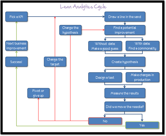
The result with Bayern Munich is well known; two losses by a net margin of -7. This ends up a point collection of 0% and average net margin of -3.5. Barcelona did not win the Champions League because they played Bayern Munich. They lost the Supercopa and the Copa del Rey because they faced Real Madrid. They won La Liga because they beat all other teams. Simple. Steve Blank is a consulting associate professor at Stanford University and a lecturer and National Science Foundation principal investigator at the University of California at Berkeley and Columbia University. He has participated in eight high-tech start-ups as either a cofounder or an early employee. Great visualization produced by Avinash Kaushik - The Lean Analytics Cycle is a simple, four-step process that shows you how to improve a part of your business.
First, you figure out what you want to improve; then you create an experiment; then you run the experiment; then you measure the results and decide what to do. The cycle combines concepts from the world of Lean Startup — which is all about continuous, iterative improvement — with analytics fundamentals. It helps you to amplify what’s proven to work, throw away what isn’t, and tweak the goal-posts when data indicates that they may be in the wrong place.
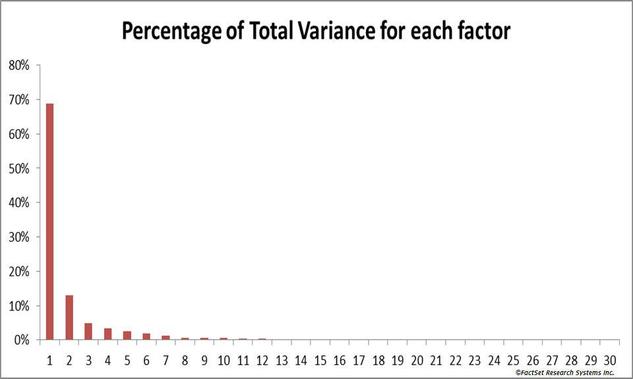
This graph shows the relative role of independent factors in a system of 30 identifiable factors. Over 80% of the variations can be attributed to the first 2 factors. In a system with “fat tails” it will be even more concentrated with 99.999% coming from one single factor.
If you are right on Factor 1 (and possibly 2) the rest is irrelevant. The problem is that others will drag you into factors 3 through 99. All this does is distracts from the core issue. Others will want to cover all sides of an issue, because those issues do impact the variance. But it only drives you to the irrelevant and drowns your Factor 1 argument. If you do things right, you should have only one argument. So, what is your Factor 1? It isn’t always intuitive. As Leonardo da Vinci is attributed to have said, “Simplicity is the ultimate sophistication” It can take a lot of effort to separate out these factors, to understand clearly the variances and to make the complex simple. The promise of analytics should be to help you identify your Factor 1. Once you know what it is, don’t allow anecdotal evidences, politics, incompetence, and the difficulty of solving Factor 1 prevent you from taking it on. Below is the text of The Final Speech of the Great Dictator, delivered by the character, the Jewish Barber, in Chaplin’s 1940 film, The Great Dictator. The Jewish Barber was played by Sir Charles Chaplin. Thursday April 11, 2013 I will be presenting 5 Tips for Creating Compelling Dashboards
Here is an overview: Do you spend more time creating a report than analyzing the data? Does your organization use the same reports they did 5 years ago? Creating dashboards is an important part of being able to quickly understand data. The last few years have seen several advances in the visual display of quantitative information. We understand now more about how our brain and eyes can understand information. There are several new tools in the recent years that make reporting faster and less error prone. We will cover common dashboard pitfalls and explore new techniques. At the end you can take some practical advice with you on how to refresh and improve your reporting. You will learn to:
(To see the entire powerpoint presentation clicl "Read More") A little out of the normal scope of what I blog about. But I wanted to share this article and also save it for later. Understanding Validation: A Way to Communicate Acceptance One of the four options we have in any problem situation is acceptance. Validation is one way that we communicate acceptance of ourselves and others. Validation doesn't mean agreeing or approving. When your best friend or a family member makes a decision that you really don't think is wise, validation is a way of supporting them and strengthening the relationship while maintaining a different opinion. Validation is a way of communicating that the relationship is important and solid even when you disagree on issues.
Validation is the recognition and acceptance of another person's thoughts,feelings, sensations, and behaviors as understandable. Self-validation is the recognition and acceptance of your own thoughts, feelings, sensations and behaviors as understandable. Learning how to use validation effectively takes practice. Knowing the six levels of validation as identified by Marsha Linehan, Ph.D. will be helpful. |
BERN BLOGBlog written by: Other Useful blogsArchives
June 2013
|


